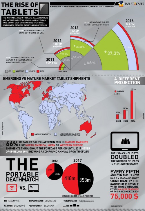
Remarks on a new piece of infographics I finished a couple of days ago for Tablet2Cases – a company not only focusing on selling cases for a great variety of tablets but also keeping a tablet wiki with relevant data running. Inside – pics on drafts and notes on how this infographics ended up the way it is. (Note: there are a few more infographics posts coming up like this on my related projects and a much bigger one on visual resumes, stay tuned!)
PRE
Need more infographics how-tos? Check out part 1 and part 2 of my ongoing series on how to make a visual resume.

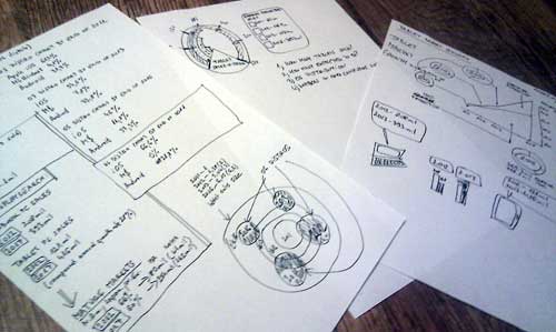
Step 1: Plan accordingly. Adobe and Corel aside, when a company gives you a dozen pages of stats and press releases, you’ll go at the printouts with a pen and a scalpel, cut out the bits that you don’t need, spare the ones that you need to illustrate. Throwing the first two or three drafts aside might not be a bad idea – still, you need to sketch them to make your mind working on the problem. What’s really important is: do not start drafting/sketching your stuff before knowing what data you’ll need to illustrate. The image above illustrates three different ideas – the leftmost one illustrates tablet market growth and OS distribution simultaneously but it’s comprehensible for the casual viewer. I know, I tried. If it doesn’t work with target market test viewers, go back to the board. The middle one would be a good idea if our topic had anything to do with speed. It doesn’t. So I scrapped it. The rightmost one is a standard area graph with pie charts, a more traditional approach of presentation. Scrapped it.
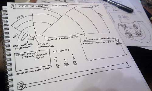
Stayed with the idea on the image below (what I ended up with as a final version). Section 1 is the main focus of this infographics, all the rest comes below arranged in more or less of a grid format. Note by ingenious use of more stuff about stuff.

Step 2: Sketch up, rock out. Sketch up main focus (also known as the hook) of the infographics. Arrange draft graphs or grids to give you an idea of how the whole thing’s gonna look like. If you have a hard time looking at structure without the actual images (yes, this comes with a lack of imagination), this is the point where you have to persist and keep on going. Sketching is fun, this is considerably less so. Keep on going. Decide on colors, fonts and the number/type of images or vectors.
Step 3: From hardcopies to colors. Format is also an issue. Although today’s infographics are often long and you have to scroll until mañana to the bottom, keeping it to A/4 proportions seems like a good idea – it’s easily printable, especially if you need it for business purposes. Colors? White backgrounds can be a problem – if they get embedded in sites with white backgrounds, not being able to see where the site ends and the infographics begins is quite a bit of visual dissonance. Black background? Try printing it out or have fun reading 6px light typefaces. Also – try using two colors and avoid more. The reason why I used more is the hook and the need to represent four different operating systems with four colors. It seemed like a good idea to go with #A4C639, which is Android’s brand color – read more on the online branding/presence of Android here. Which in turn ended up to be the only dissonant color, otherwise I stuck to a hue of blue/grey and red. AND BLACK. Fonts? Some kick-ass sans serif types that you can see in new designs like Klavika or DIN Pro or any of their variants or clones.
From here on, stuff gets easier – market sales are best illustrated on maps with country borders, different projections for sales go well with bar graphs and pie charts are not to be dismissed if you can have a lot of black in them. Hehe. Also note the point that although you’ve gotta go proportionate with illustrating data, you don’t have to go for mathematical precision. I tried doing that with the hook – and calculated percentages and mapping them on a polar grid made out of 150 concentric circles to give viewers the best feel for a relative/proportionate number of sales, but it definitely wasn’t the case with the sales comparison of tablets and notebooks. Comparing small, barely readable with obviously so much bigger pie charts with tablets so visibly gaining the upper hand obviously lets you discard the surgeon mathematics for a workphase.
Also, adding the press releases I based this infograph on seemed like a good idea – bit.ly shortened URLs don’t take up much space and even though they’re not clickable, memorizing the few identifier characters isn’t that hard, if you’re really intent on going after the hard data.

That’s basically it – if you have any ideas, comments or remarks – add a comment or drop me a mail at planetdamage at gmail dot com and also feel free to check out Tablet2Cases, the company I did this infographics for – they sell great stuff! Thanks goes to Moiré for the occasional brainstorming help and Inked Up for the brainsoothing eyecandy. ROCK!