Hello. This is Damage Von Rock and whenever you’re reading this, I’m just about to drink another triple ristretto boiled with Red Bulls. And boy, do I see noises. And when that’s not happening, this happens ALL THE TIME, I’m doing other fun stuff, like getting my book released on future research/pop culture or designing an infographics CV for my long-time friend Sylwia. Check out her massive social portfolio and click more to see how her CV came to life.
Pre: It might be a good idea to read up on the first part of the how to make an infographics CV session!

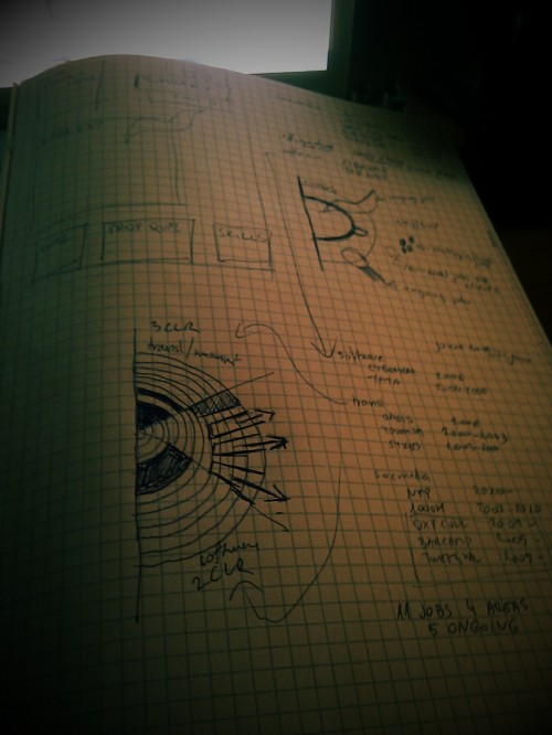
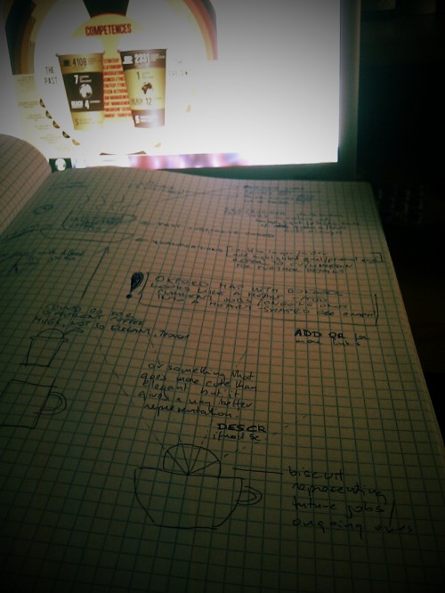
Step 1: Plan accordingly. Contrary to all the things I did with my own CV (updating CVs, gathering references and planning a wheel crowded with more than a dozen major jobs), Sylwia sent me a three-page long CV and asked me to use coffee as a major design element. You’ll see how the whole brainstorming process went by the design ideas I carved up – the biggest challenge was to simultaneously illustrate 5 ongoing jobs with her previous references. Off went the top-view coffee mug, then in came the side-view coffee mug with a protruding half-biscuit which happened to die miserably as well. After spending some time on Shutterstock (thanks @dawe_!), I came across that double coffee mug combo that looked like an instant win, so I took that motif and started working away with it.

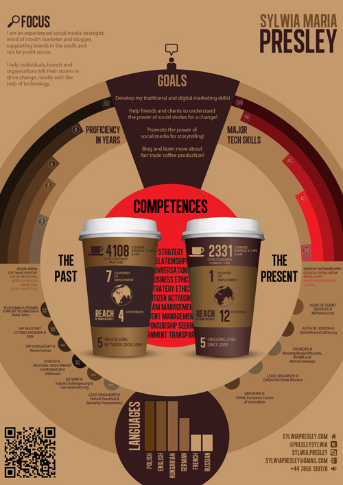
Step 2: The circle innards. The human brain loves circles, so I knew I had to illustrate data in a circular arrangement and I also needed to make some visual disruption, so I just made it big enough for the sides to fall off the artboard. The smaller red circle is not only a huge eye attractor but a visual pun as well, listing all the competences that are pretty well covered by the coffee cups. The Alégre Sans NC type I used here is quite dense and it gives off a nice, slick, condensed look. The akimbo cups did save me by giving me two separate areas to use for past and present jobs – originally I wanted to illustrate everything on these. Then Sylwia sent me a few trivia bits and it seemed like a good idea to put all the trivia on the cups and use the outer circle for showing off references.
Step 3: Circle, the top half.
Sylwia has some serious background in social media, software support, social reporting, word of mouth marketing and event marketing, so the top left half illustrates the relative duration spent in these fields (in years). I color-coded these even before I had the jobs arranged below because it seemed like an obvious idea to use color data to save up space. The top right half is in a similar arrangement but it lists major tech skills. After having settled with shades of brown, red seemed to be the only good idea (especially that I already had the huge red circle in the middle!) for the major tech skills quarter-arcs, although I’ve tried huges of blue, green and grey as well. They sucked major critical ass. (Actually, blue didn’t suck that much, but I wanted to keep this CV as intact as possible.) Top middle – goals, pretty self-explanatory.
Step 4: Circle, the bottom half.
Bottom left has the past jobs and bottom right the ongoing ones, color coding done based on the top left sectors – using half-circles along the perimeter counters the stripy, more angled feel of the top half – this is also reflected in the languages part. Come to think of it, I could have shown language proficiency with circle sizes but I guess I just felt that the graph tool will work here just fine.
Oh, one more thing. If you read the infographics how-to part 1, you might remember how meticulously I’ve done the concentric circles. You can either go super detailed with that or use the polar grid tool which gives you a 5-seconds solution instead of a 45-minutes one.
YOU WANT AN INFOGRAPHICS CV FOR YOURSELF?
Drop me a mail. We’ll talk about it.
