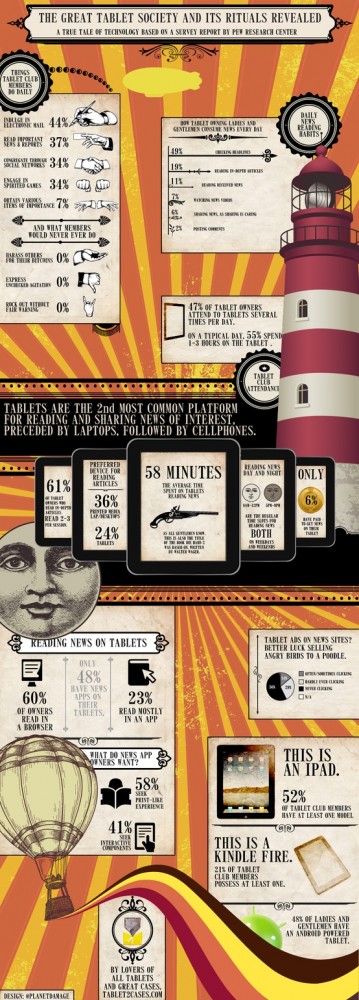
In January I closed the manuscript for my first book DAMAGE REPORT and promised not to touch text for a long time. So I started researching into infographics instead. Eleven months later I won the infographic challenge put on by The Economist, the Pew Research Center’s Project for Excellence in Journalism (PEJ) and visual.ly. Read more about that here – where you can (and should) check out the other winners, THEY ROCK! (Well, that wasn’t exactly Tim Ferriss tempo but I’m trying my best to get there.) I also have to mention that this work is a joint submission – appearing in the colours of tablet2cases.com with whom I’ve been working with for almost half a year now on visualizing data about tablets and related consumer behaviour patterns. If you want more eyecandy, check out my portfolio here!
