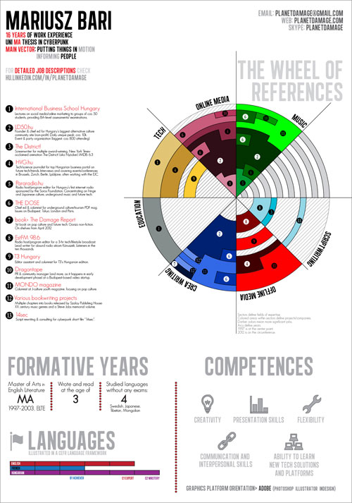
 (click here for high-resolution version)
You need to get the message across. Everybody does. And when the whole platform of getting it through becomes a CV, most of the time you don’t go McLuhanesquely the medium is the message, you crank your references into two Europass pages (HR people won’t read more than two, CEOs won’t read more than one if you have the LUCK OF THE GODS) and that just doesn’t cut it. Infographics CVs have been around for some time now and I’ve just done one. It’s the very colourful pic above. What’s that, what’s the concept behind it and how can you make one? Answers below.
Infographics CVs instead of normal CVs work best when
- you need to present a lot of data in concise graphical form that would be troublesome to show in more than two pages
- you want to impress
- you work in a field that sympathizes with an idea of an infographics CV (and that just won’t do for government officials, attorneys and those in equivalently high positions but correct me if I’m wrong)
I’ve always worked in media and the creative/content generation industry with a tweak and it’s been some sixteen years now. It’s getting increasingly hard to push 16 years of projects into two pages so I decided to switch to a different approach and try to represent my professional side in one single page. If you find data visualization appealing or outright sexy (I do!), then you know that doing one is a hell of a ride. It’s not that tough, if you’re motivated enough and love learning new stuff, if you need calculations for manhours: planning took approximately a day, doing it was five or six nights altogether (most of that was spent half-asleep or I was simultaneously working on two other things as well), so all in all you could finish a similarly complex one in three days altogether.
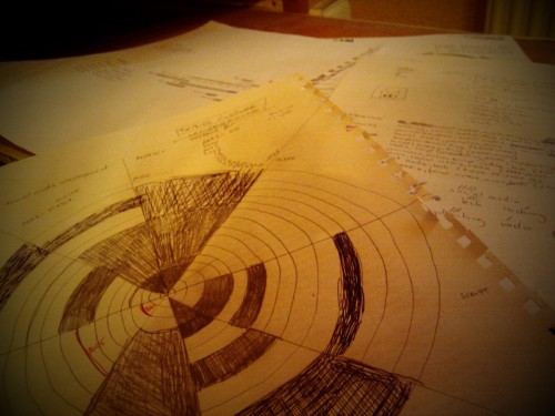
Step 1: Plan accordingly. I never read the manual and never do preliminary planning but you simply can’t skip this part. Taking years of references and data and putting them into any kind of infographics will do require careful planning and drafting and tearing pages and spilling coffee over them, saying fuck and doing it all over again. I checked out a lot of infographics CVs to see what others ended up doing and tried a few resume visualization services that dig out your Linkedin data and then come up with something out of it (like vizualize.me or check the others Mashable just gathered). They’re great for giving you ideas. They gave me the idea is that if I’m doing this, then I’m doing it my way.
After all the sniffing around, I ended up sticking with this circular approach that seemingly gives a lot of space to work with. (It doesn’t if you need to visually represent multiple simultaneous jobs in the same field of work but more about that later.) Did a write-up of previous jobs, keyworded and cross-referenced them to find out the least number of fields of expertise I can group them to. Started with 13, ended up with 7. This might mean that I’m instantly stabbing myself in the throat if I’m sending this to a company that needs people with very focused interests and skillsets. That’s not me, so I shouldn’t worry about those companies. In black and white this looked like ROCK, then I had to color it and things got a bit out of hand.
Note 1: Freehand circle drawing is still a bitch.
Note 2: Yes, there is a Fillerbunny hidden somewhere in the drafts.
Note 3: This is most probably the time when you realize that all the work reference stuff that you have in Facebook, in Linkedin and your hard drive are three different data sets. Sychronize them. If you don’t do that now, you’ll forget about it. Trust me, I would know. I still haven’t.
Planning doesn’t end here. After having the plans and the datasets on paper (8 pages for me), I still had to decide on the software to work with. Friends have recommended tools like pChart, R, ggplot2, Processing or Circos but I ended up using the PIXEL RULER OF THE GODS, Adobe Illustrator. Why? As for starters, I didn’t know how I’ll use the infographics on the main page design at first so I needed a vectorized version so that I could resize it randomly like a maniac and secondly, I’m down with the Adobe logic. There. Work starts now. (And gotta admit that this was the point when I got a lot of help from my friend Livililli of the Pimpmywall crew for helping me out with a few things, massive respak, lady!)
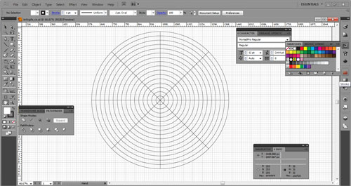
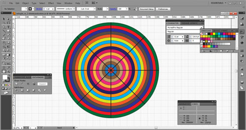
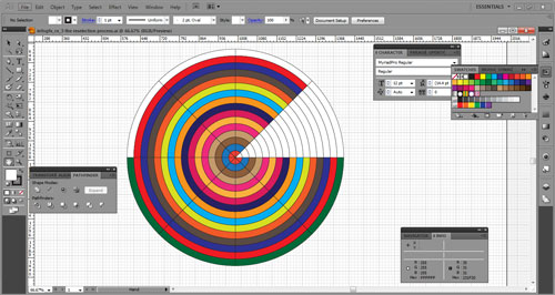
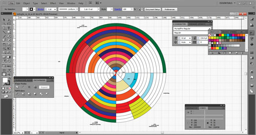
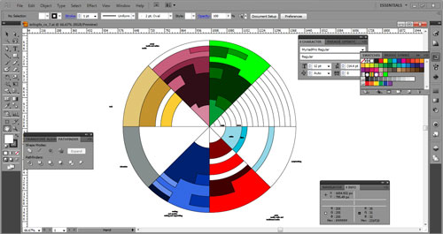
Step 2: The Wheel of References. This is the central eye-catcher dataset of the whole CV in circular segments of awe and doom in shades of mystic colors. If it looks like something a three-year old went at, it is because the arcs/concentric year-representing circles needed to be separated. The pic above actually shows an aptly colored version. Here’s the meaning behind it all:
Sectors define fields of expertise. Colored areas within sectors define jobs. Arcs define years. 1997 is at the center point. 2012 is on the circumference. Darker colors mark more significant jobs.
Illustrating seven fields of work just rocked, because you can simply work with 45-degree lines to dissect the circles to 8 segments, leaving one batch of arcs that you can use for legend, explanation or design – I went for minimal design. As for the tri-segments in each year, that was sort of a problem and I feel happy that I only had to represent three different jobs in a year – and even like this it’s a bit fuzzy to look at. Recoloring the random bits to darker/lighter shades of arbitrary colours was the next step – no hidden meaning behind the education part shown as grey. Heh heh. (No, seriously.)
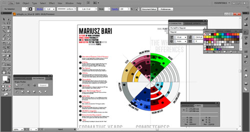
Step 3: Adding le boring text. Although less is more, I actually do have to add a bit of explanation for the wheel that looks like a vector sunflower on acid. The font for the top left textbox is Alégre Sans NC, the light sans serif explanatory font is GeoSansLight. For the numbers I could have gone for masking random font numbers out of circles, but I’ve decided to go for a wingdings type specifically done for that called numberpile. Also decided to pattern up the white parts (where nothing work-related happened). As for the text that I put under my name, I had to come up with a few key points that are instant giveaways: the number of years I’ve worked on, the kind of personality that I am, the field of interest that I have and what are the two main things that are my attractors for work. This is actually the point where you have to decide about what you tell about yourself and you have to shape it out a lot. But more about that a bit later.
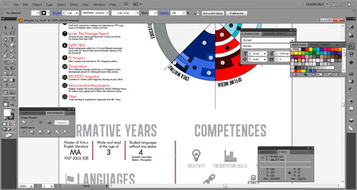
Step 4: Straighten out the wheel and add what’s necessary. The numberpile numbers looked like crap, so I had to resize them a bit and change their colours on the darker areas. I also needed to add details of my education. I added only the university part because I’ve obviously done high school (so I can skip mentioning that) and on top of the CV I also said my thesis was done in cyberpunk. That’s basically enough: if a potential employer wants to know more, I’m happy to give out further details. The two other trivia in the section Formative years? Reason: I needed two placeholders that are actually true. For the Competences part I’ve googled up a few pages about how HR people monitor/grade skills in applicants and picked a few that are really, really strong in me. Without further details I’ve decided to only add the names with icons. Why? Because all the competence details are actually hidden in the reference descriptions.
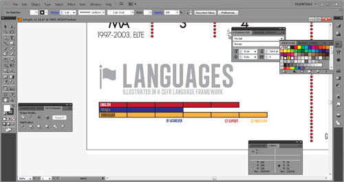
You can’t miss the Languages part in a CV! I really, really liked how visualize.me represents your language skills (showing you the number of countries on a map where you can survive with your language set, amazing!) but I’ve gone for a more simple representation. Europass used the CEFR grading for language proficiency, so I decided to keep that and represent it like this. It sucks like a leech with these colors. I know.
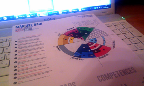
Step 5: Print it out. This is when shit hits the fan, you get a reality check and find out that your fonts are way too small, your colors eye-hurting and how the whole design just doesn’t click. Or it might click but doing a hardcopy is something you shouldn’t ever skip. I printed this out and then I saw how the language colours don’t work for me at all, how I’ve missed adding patterns in the offline media section and that I’ve somehow mysteriously deleted the number 1 from the wheel and the reference list. So off I went and corrected them to the version that you’re seeing below.
 (click here for high-resolution version)
Step 6: Stop somewhere. And if you’re a meticulous bastard like me, you’ll always go like this is not so good, less is more is nice but let’s add decorative bullshit or, does this really work at all. The idea worked for me for a long time so if it seemed like a good idea back then, it’s good now. Is it perfect? Far from. But that’s a good tool to work with, a good representation of the professional me for would-be employers and I actually had to learn the basics for Illustrator to be able to do that and learning new things is very, very fine with me.
Show me your own versions and ideas, I’d love to see what this post did to the inside of your precious brainmeats!
Always,

UPDATE 1: Thanks a lot for all the constructive comments and criticism that I got, a great way to get crowdsourced help and feedback on this! Remember the part about have your Linkedin profile straightened out? This is the thing I’ve been doing for the past four hours or so :) Added that link to the CV and took out the Double Gemini personality part. Reason one: needed space in the top left corner. Reason two: although I really am a textbook Gemini personality (regardless of how I feel about astrology), this really kicked the bucket, Skyrim-style, off the heads of a lot of people with the same mindset which got me thinking. Thirdly: the Prezi people asked me why I didn’t put my CV into their presentation software (that I actually used at IBS and at Dragontape) so I thought why the hell not? Drop me a line if this flies out the window with an out of memory bug!